I've been keeping a folder on my desktop. Anytime I find something I want to apply to my senior project, I stick it in there. Most of the pictures are "do"s, but there are a few "don't"s in there as well. Here's a sample, with my thought behind each photo:

This is Death from
The Particle Tarot, by Dave McKean and Alejandro Jodorowsky. Although this is a thousand times more digitally altered than I would like my deck to be, I enjoy the strange beauty. Also how much of the frame is taken up by the face instead of the entire subject.

This card comes from one of the few photographic tarot decks I was able to find online that didn't make me cringe. It's called
The Healing Tarot, by Rev. Jennifer Elizabeth Moore. It gives me hope that maybe being thrifty and on a low-budget can still give me interesting and symbolically significant pictures.

This is the Tower card from Bea Nettles'
The Mountain Dream Tarot. I'm concerned about how I'm actually going to pull off the tower card. I don't want to build something, but I'd also like to have a minimal amount of actual background in the cards.

This is a possible solution to my Tower problems. This is from
The Golden Tarot of Klimt by A.A.Atanassov. While there is still a building present, it is more focused on the falling figures. I'll work on that.

I found this signage-based minimalist interpretation of the Major Arcana through a google search, and have not been able to find any actual information on it. It appealed to the graphic designer in me and made me laugh.

This is the Strength card from the
SPILL Performance Tarot deck, which was a collaboration between the SPILL Festival in London, and a variety of collaborating artists listed on the page linked above. I would put all their names here, but there are literally about 30 of them. I really liked the interesting composition in this card. It stood out a lot to me.

This is the Star from the
Silver Era Tarot, by Aunia Kahn and Russell J. Moon. I like the composition and interpretation once again. The editing and consistency in the rest of the deck that I have seen is not perfect, but they got published, so that gives me hope.
 Joel-Peter Witkin
's La Giovanissima. I really like the simple textured background and the softness of the exposure.

This is the Temperance card from il Sentiero dei Tarocchi by
Giovanni Pelosini. It is a strictly Major Arcana deck, and in every card these two friends are dressed the same. I thought it was hilarious, as well as well interpreted and beautifully colored.

This is the 8 of Wands from the
Tarot of the Boroughs, shot on location in New York by Courtney Weber and George Courtney. I was interested in the fact that although this is the 8 of Wands, there are no Wands present in the photograph. I don't think I'll go with that (it would make reading harder and I don't want text on them) but it's interesting to know that that option does exist.

This is the Magician card from the
Parfait Amour Tarot deck by Will Parfitt. It's another strictly Major Arcana deck. I'm really enjoying what he's doing with long exposure in this photograph. I don't know if I necessarily want to do that, but I like the ethereal effect.

This is a great picture of Neil Gaiman and Amanda Palmer that I really liked. Maybe I can adapt that composition into my Lovers card?

I don't remember the name of this deck, but I liked it a lot. It's all piece of scrap metal and junk that have been rearranged to make pictures. It's really awesome.

I'm also considering a Lovers composition like this. I can't find where I found this.
 Erwin Olaf's
 Chessmen series. I like the simply constructed mish-mashed props and the idea of reconceptualizing a common and already highly-interpreted subject matter.
 Erwin Olaf
's Blacks series. I actually thought that this was an interpretation of the Major Arcana the first time I looked at it and it actually sparked this whole project.

This is the Temperance card from the
Carvin Rinehart Tarot. It's still in progress, but is yielding some beautiful things. It's probably my favorite photographic tarot out there, and completely stunning.

These are the stars of Harry Potter going into King's Cross in their aged makeup to shoot the Epilogue to Deathly Hallows. I liked the whole bagfaces imagery. I'm not sure where I could use it, but it stuck with me.

I like the incorporation of other screen shots of this performance piece into the main one. For a while I was thinking of using other printed photographs in the actual set up of the cards as background or whatnot. Then I started thinking that maybe that wouldn't look so great. But this is kind of related to that though process.

This is the album cover to
Cecillia Bartoli's Sacrificium. I have been unable to discover who the cover artist is, but I enjoy the way the photograph is very undersaturated, and could be in black and white except for the ruddiness on the statue. I think I'm going to go for something like that. I love black and white, but I don't want to be Bea Nettles.
 This is Death from The Particle Tarot, by Dave McKean and Alejandro Jodorowsky. Although this is a thousand times more digitally altered than I would like my deck to be, I enjoy the strange beauty. Also how much of the frame is taken up by the face instead of the entire subject.
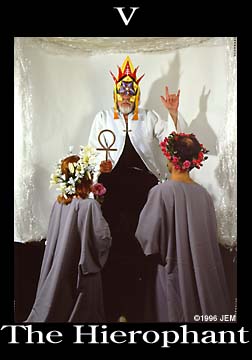 This card comes from one of the few photographic tarot decks I was able to find online that didn't make me cringe. It's called The Healing Tarot, by Rev. Jennifer Elizabeth Moore. It gives me hope that maybe being thrifty and on a low-budget can still give me interesting and symbolically significant pictures.
 This is the Tower card from Bea Nettles' The Mountain Dream Tarot. I'm concerned about how I'm actually going to pull off the tower card. I don't want to build something, but I'd also like to have a minimal amount of actual background in the cards.
 This is a possible solution to my Tower problems. This is from The Golden Tarot of Klimt by A.A.Atanassov. While there is still a building present, it is more focused on the falling figures. I'll work on that.
 I found this signage-based minimalist interpretation of the Major Arcana through a google search, and have not been able to find any actual information on it. It appealed to the graphic designer in me and made me laugh.
 This is the Strength card from the SPILL Performance Tarot deck, which was a collaboration between the SPILL Festival in London, and a variety of collaborating artists listed on the page linked above. I would put all their names here, but there are literally about 30 of them. I really liked the interesting composition in this card. It stood out a lot to me.
 This is the Star from the Silver Era Tarot, by Aunia Kahn and Russell J. Moon. I like the composition and interpretation once again. The editing and consistency in the rest of the deck that I have seen is not perfect, but they got published, so that gives me hope.
 Joel-Peter Witkin's La Giovanissima. I really like the simple textured background and the softness of the exposure.
  This is the Temperance card from il Sentiero dei Tarocchi by Giovanni Pelosini. It is a strictly Major Arcana deck, and in every card these two friends are dressed the same. I thought it was hilarious, as well as well interpreted and beautifully colored.
 This is the 8 of Wands from the Tarot of the Boroughs, shot on location in New York by Courtney Weber and George Courtney. I was interested in the fact that although this is the 8 of Wands, there are no Wands present in the photograph. I don't think I'll go with that (it would make reading harder and I don't want text on them) but it's interesting to know that that option does exist.
 This is the Magician card from the Parfait Amour Tarot deck by Will Parfitt. It's another strictly Major Arcana deck. I'm really enjoying what he's doing with long exposure in this photograph. I don't know if I necessarily want to do that, but I like the ethereal effect.
 This is a great picture of Neil Gaiman and Amanda Palmer that I really liked. Maybe I can adapt that composition into my Lovers card?
 I don't remember the name of this deck, but I liked it a lot. It's all piece of scrap metal and junk that have been rearranged to make pictures. It's really awesome.
 I'm also considering a Lovers composition like this. I can't find where I found this.
 Erwin Olaf's Chessmen series. I like the simply constructed mish-mashed props and the idea of reconceptualizing a common and already highly-interpreted subject matter.
 Erwin Olaf's Blacks series. I actually thought that this was an interpretation of the Major Arcana the first time I looked at it and it actually sparked this whole project.
 This is the Temperance card from the Carvin Rinehart Tarot. It's still in progress, but is yielding some beautiful things. It's probably my favorite photographic tarot out there, and completely stunning.
 These are the stars of Harry Potter going into King's Cross in their aged makeup to shoot the Epilogue to Deathly Hallows. I liked the whole bagfaces imagery. I'm not sure where I could use it, but it stuck with me.
 I like the incorporation of other screen shots of this performance piece into the main one. For a while I was thinking of using other printed photographs in the actual set up of the cards as background or whatnot. Then I started thinking that maybe that wouldn't look so great. But this is kind of related to that though process.
 This is the album cover to Cecillia Bartoli's Sacrificium. I have been unable to discover who the cover artist is, but I enjoy the way the photograph is very undersaturated, and could be in black and white except for the ruddiness on the statue. I think I'm going to go for something like that. I love black and white, but I don't want to be Bea Nettles.
No comments:
Post a Comment